Sunday, January 31, 2016

30 DAYS OF INTENSE PAINTING


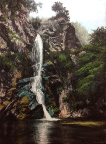
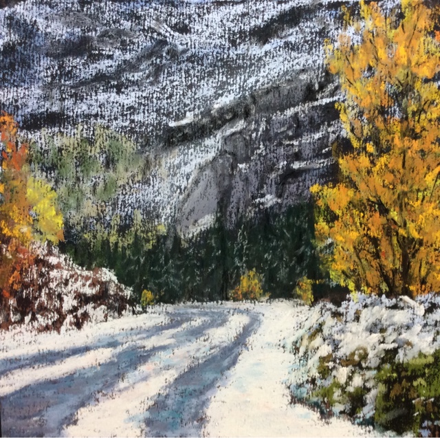
                           15 of the 30 Paintings   All Pastels | Various sizes

The 30 Paintings in 30 Days Challenge is officially over, even though I will continue to paint more frequently (perhaps not every day) because of it. It is a grand way to start out the year of painting. It has been said that an artist must paint at least a thousand paintings in order to acquire the skills needed to become a master.  In years past, I've thought 30 or 40 paintings was a lot to produce, but then I was working as a full time Realtor as well! Now that I've retired from that, I've upped my game, producing 106 last year. This year, again I'm increasing my goal to 125. Doing this challenge means getting into the habit of producing daily and gives one the training of producing whether one is inspired or not; all essential skills to meeting my long term art goals. It is so obvious as I go along that these (my 3rd) 30 day challenges produce instantly recognizable progress in my skills.  

Painting Notes: While I am a confirmed pastelist, I do find myself drawn to experimenting again in oils, perhaps the water soluble ones or even acrylics which I watched Gil Dellinger use so interchangeably with pastels in a workshop years ago.  It is a hard transition when one becomes so familiar with a medium that paintings are produced almost effortlessly to then change to the slow unsatisfying use of an unfamiliar medium.  I have so much further to go with pastels and I do so love the stroke making they allow.  It is just a thought - we'll see where it leads me! Stay tuned!  

Friday, January 29, 2016

FALLING WATER


                                   Falling Water   Pastel | 12x9

A few years back, we travelled into the Angeles National Forest while we were down in Southern California.  My husband, from that area, suggested a waterfall hike as he knows I love to reach water as a destination.  I was mesmerized by the beauty of this fall and took an endless number of photos from every angle we could reach.  I truly believe there is magic in falling water.  Easy to believe I'm a Pisces!

Painting Notes:  I picked Wallis Warm Belgian Mist again for this piece, grid the surface and then drew it rather precisely before filling in a lot of darks.  I sprayed them well with fixative, then started the process of redrawing it again using the local colors. For a while it looked like a puzzle of pieces but as I refined it, each piece got filled in and ready for the final application of a bright yellow/white for the falling water.  The water reflections were the final part to fill in, using downward vertical strokes across the colors followed by horizontal strokes. 

Tuesday, January 26, 2016

THE NOBLE BEAST


                                     Scooter   Pastel | 16 X 20

It was love at first sight for me. A friend posted a photo of their dog and I immediately had a mental picture of a library with roaring fire, the noble baron swirling his bandy snifter while his faithful dog stared lovingly into his eyes.  I saved the photo; years went by till I was invited to be in an upcoming show, Bark! - celebrating all things canine.  I knew is was time to paint this particular lovely beast.  Having spent weeks on this painting, I feel like I have spent weeks with Scooter and come to love him ever more. 

Painting Notes: I chose Ampersand Pastelboard for this larger format painting as the stiff backing and nice surface made the whole process a pleasure to paint. Never did I feel I was fighting the substrate; rather it seemed like the image and the substrate were made for each other.  The drawing was intensive work and took several sessions. I applied an underpainting of dark aubergine hues around the dog's outline, then concentrated on the dog til he was mostly finished before ever starting the background. His pose was such that I felt the need to make the chair he is draped over as realistic as the subject.

SUNSET OVER RIFFLE LAKE


                                   Sunset over Riffle Lake   Pastel | 5x7

Driving through Oregon in November, we were looking for a campground to no avail when suddenly, we saw an arrow for a lakeside forested campground.  A few miles down the road, we saw this wonderful sunset reflecting onto Riffle Lake.  It was a moment of wonder that we stopped for and took in, in silence. A lovely way to end a perfect day on the road!

Painting Notes:  Yesterday, my splurge arrived - 24 Sennelier Iriridescent colors!  It has been on my wish list for over a year.  I used Canson Touch again - a piece that I had rubbed in the previous painting leaving behind a dark multi-colored surface. The iridescents we're peculiar to work with - they went on beautifully on the lake surface and the dark foreground, but the paper didn't like my using them in the lights in the sky; in fact, they removed some of the previous colors I had put down.  Definitely something to work with and try on different surfaces til I get it right! 

Monday, January 25, 2016

EARLY SNOWFALL


                                         Early Snowfall    Pastel | 6x6

That first snow each year is so magic. We're not yet tired of slipping and sliding and digging and freezing. Colors that seemed so mundane a day before are transformed into brilliant sparkles of light against the white snow.  We often take trips into the mountains after these early storm days, savouring the lovely beauty inside the cozy warmth of our van.

Painting Notes:  I'll say it again, my favorite surface to paint on is Wallis Warm Belgian Mist.  I did the underpainting in the darks for each shape, then used my pipe foam to smear it into the surface except for the left rise and the right front bush where I wanted to keep the most texture.  During the painting, I let the strokes in most of the areas skim over the surface of the paper so that the darks would show thru. It gave a textural quality to the areas. I believe it also made a difference to use the paper in this direction as I wanted the striations to be vertical rather than horizontal. 


Sunday, January 24, 2016

A FLEETING MOMENT AT DUSK


               Twilight   Pastel | 4x6

Twilight is that perfect time in the evening when the sun has just disappeared below the horizon line and the sky puts on her most brilliant color show.  Looking across the meadow, the trees and forest were dark shades with no discernible forms.  

Painting notes: Working with a limited number of strokes to make this small painting of a brief moment in time. The substrate is a Canson Touch but I have no idea what original color it was. Often, when I'm not happy with a painting, I will use the pipe insulation foam to rub it all in and then spritz it with ISO to make a whole new surface. I'm glad this filled in some of the nubby surface, giving me the dark brown color I wanted to paint on but without too many pits.

Saturday, January 23, 2016

THE GREAT BLUE HERON


                                       The Great Blue Heron  Pastel / 6x8

IF I were Native American (which I'm not) and IF I were to take a spiritual guide, the Great Blue Heron would be my choice.  It embodies the traits of my solitary side - comfortablness in being along, in entering unknown situations, in seeking out my own path.  I have long felt an affinity for this magnificent long, lanky, solitary figure.  We are lucky around here to have a lot of them, even within the suburban landscape. Proximity to the Sacramento River enhances that.  I can't recall ever seeing two or more together, though. That would be a highlight, especially to see a heron couple!

Painting Notes:  I immediately went to a sheet of Canon Touch in blue for this. The drawing was done carefully but of course, on this size paper, it was difficult to get the points I wanted and fill in narrow feathers. Again, I'd say this nubby paper - Touch - for me works better when I'm painting larger than smaller. I would liken it to a UArt 320. I used my 'magic blender" a lot on the background - a rubber finger tip turned inside out. It is a lovely tool for blending as it pushes the pastel into the gritty surface and yet does not take up any of the powder, creating an almost velvety smooth surface, perfect for some skies and hazy backgrounds that stay in the back.


Thursday, January 21, 2016

CARIBOU LAKES DIPTYCH

                    Lower and Upper Caribou Lakes   Pastel Diptych (2 pieces) | each 6x4

 Lower Caribou Lake  
                                Upper Caribou Lake  

Several years ago we made a two night camping and hiking trip up to the Trinity Alps in Northern California.  We backpacked in eight miles to these lovely Caribou Lakes. It was Labor Day and we were surprised to find very few others here.  Perhaps that was because the weather turned very cold and windy the first night. Our dog Candy slept inside the tent, wrapped in her own tarp but she (and we) shivered all night. The next morning, seeing the the storm system was worsening, we made the decision to hike back out. That was a good thing as a rainstorm with thunder and lightning came in as we made it back to the car several hours later.  It did not dampen our enthusiasm for this gorgeous area, so worth the effort to get to.

Painting notes: I'll admit the idea of making a diptych was a calculated one. I'm behind in the 30/30 Challenge as I have a deadline to complete and deliver a larger dog painting for an upcoming gallery show. The past three days have been spent tied to the studio to execute a very realistic portrait of a friend's dog that I saved from a Facebook post years ago. I'll be posting that shortly. Tonight was the need to post yesterday and today's entries for the 30/30.  I painted this on Canson MiTeintes Touche - a nubby paper that comes in a fabulous shade called Tobacco. I love this rich dark brown and long to do a large painting with it, as larger means less nubbiness overall.
      

Tuesday, January 19, 2016

DOG DONE - Now On to the Background


                                      Now for the Background!

Thursday, 2 days hence, this finished dog portrait is to be done and a digital image sent to the Gallery. Will I finish in time? That is 'la grande question'!  Deadline painting is always to be eschewed. Why, I ask myself, again and again, have I become a 'Deadline Painter'?  I wasn't before, in my 'real life'. In fact, I've lectured others for years to take care of it when it first occurs to you, don't dawdle, make it happen way earlier than others expect it. Those are the lessons of being successful, or at the very least, perceived as successful.  But now, I'm retired..and I'm no longer driven to do what I think is required of me. In fact, I deliberately Don't do what I perceive is required.  Oh my! The liberation of this! And I'm okay with it! 

Painting notes:  For years, I've heard and read about pastelist who do not use fixative at the end to freeze the image in place, but rather, DURING the process. I totally get it painting this essentially black/ white/gray dog on a dark background. His outline has to weave in and out of the dark background. This is best done by putting down the dark, fixing it, adding the light, fixing it, and going back in with the dark. Otherwise, the dog would have a burgundy mist as his outline!

Monday, January 18, 2016

STAGES OF A DOG PORTRAIT


                The Eye of the Dog

I labored for hours today painting this dog portrait for the upcoming Bark! Show at Natsoulas Gallery in Davis California beginning in February. It was a joy to see the personality of Scooter come shining through stroke after stroke. What was difficult with depicting the curly hair that drew me to this dog in the first place. Being a realist, I feel as though I'm painting every hair is a separate stroke.  He is a beautiful Aussie–doodle!

Painting notes:  I am using a white Ampersand Pastelboard this. I started with a pastel underpainting and used fixative several times already to allow me to use lighter pastels over the intensely dark background.

Sunday, January 17, 2016

CRYSTALLINE HOAR FROST


                                 Hoar Frost in the Morning   Pastel | 6x12

One morning in November, while on a road trip though Oregon, we awoke again to a deep fog. As we drove along, in spots the sun would come out and we saw that the world was covered with a coat of hoar frost.  Science burger.com defines it as "Throughout late fall, winter or even early spring, just one or more days in a row of freezing fog provides an ideal scenario. The greater moisture in the air causes interlocking crystal patterns of frost to gain intricacy and size. In turn, they build up a greater depth on tree limbs, signs, fences or anything you could think of. That’s the essence of hoarfrost."  It's almost as though the land is covered in millions of downey white feathers. When the sun hits the crystals a shimmering radiance ensues, as if there were a very slight tremor to the surfaces. Jaw dropping wonder soon turned to rabid photo snapping! 

Painting Notes:  My substrate again was Wallis Warm Belgian Mist. I almost chose the Art Spectrum but with the small size of this painting and the amount of detail of the buildings I wanted to show, the Aubergine Art Spectrum would have been too nubby. Besides, heading into the turquoisey tones was more appealing than the gray purples. No underpainting, just a straight application of pastel. I let more and more of the paper color show through as I came forward and am pleased with the interplay between that warm medium brown and the teal colors.

Saturday, January 16, 2016

THE QUEEN HEN


                                     We Are Not Amused   Pastel | 4x6

I raised a few chickens in my Sacramento backyard years ago when we were trying to get the city to legalize them. I was even a member of CLUCK - the most aptly named acronym for an organization I've ever heard of - Citizens for Legalizing Urban Chicken Keeping.  We were finally successful in getting the specific wording changed from not allowing 'chickens' to not allowing 'roosters', and of course, sundry fees associated with that.  By that time, I had given my clucks away. Even tho I loved the eggs and especially my bantams -Millie and Fleur- I'd long grown tired of the smells: stinky in the winter rains and stinky in the summer heat - so much so that entertaining in my 'outdoor room' proved undesirable. I learned that each hen has a most distinctive personality and one of mine was a stern task master, alpha-female of the group who had this apt expression!

Painting notes: At ten pm, longing to snooze, I set about doing a quick painting to keep with the painting-a-day routine. I chide myself every morning for not getting to the daily painting; but these days, the days are devoted to tasks and to painting a dog portrait for an upcoming show.  Really hard to sincerely bitch about this, especially when I remind myself of working before I retired!  The majority of this 'fowl portrait' was done with Nupastels. They are a wonderful pastel for times when you're drawing more than painting.

Friday, January 15, 2016

AFTER THE HARVEST


                                         After the Harvest   Pastel |  6x12

Mid October in the Shenandoah Valley Wine Country near Plymouth, Ca finds the grapes harvested the leaves turning gold and starting to drop. There are always a few stragglers left behind. Thank goodness because these clusters of leftover grapes made the scene for me.  It was a perfect autumn day, a bit crisp and intermittent clouds.  After several hours of painting, our group retired to the tasting room where a few sips led to a few purchases and lots of laughter.  There are always beautiful places to paint, but at a vineyard with a winery, there's a bonus to the plein air experience!

Painting notes:  A lovely 9x12 piece of Wallis warm Belgian Mist was taped off to make a 6x12 painting because a recent order for 9x12 frames was misunderstood and I now have six 6x12 frames.  'Making lemonade', I decided it is a lovely size to add to my 'Little Gems' collection of small original pastels; not to mention, a great plein air size.  The 2:1 ratio makes for an almost panoramic view when the scene has a horizontal quality to it. Next I'll have to use it vertically!

Thursday, January 14, 2016

SUNSHINE ON A STEM


                                  Sunshine on a Stem   Pastel | 6x6

One of the joys of my raised beds vegetable garden comes from devoting a whole bed to cut flowers. I started with multi-headed sunflowers, then added Mexican Sunflower (Tithonia-a must-try if you are into screaming red 2"  flowers!), and last year zinnias. Of course, each of these easily-spread annuals continue to pop up so each year I always have some of each. For me, there is nothing quite as joyful as having vases of fresh flowers all over  the house. The 'consumption' of cut flowers is every bit as important to me as the vegetables I pick and we eat.  

Painting notes:  Once again, I had the joy of painting on Wallis Warm Belgian Mist paper. Yes, the color is great because you don't have to fight white specks showing through or do an underpainting like the white Wallis, but it is really the surface that evokes the good feelings. It eats up the pastels, spreads like butter, and let's you easily correct by over striking or even lightly brushing off with a brush and redoing. Liking our substrates, no matter our medium of choice, is one of the things that makes an artist's heart sing!

Wednesday, January 13, 2016

CLUCK!


                                       The Chickens of Fair Oaks  Pastel | 7x5

Nearby Fair Oaks village is known for their free-roaming chickens, truly free-range poultry. Story has it began back in the late 70s when a young boy who had lived and tended chickens in the village in the 50s returned to settle in Fair Oaks along with 3 hens and a rooster. He let them roam free and somewhere along the way, locals who wanted to rid themselves of pesky crowing roosters began dropping their roosters off. Now they roam free, but the number of roosters appears to far outnumber the hens. Many don't care for the pre-dawn crowing and lately some complain about the poop, but so many of the people who live and work there find their presence a colorful symbol of the rural nature of the village. I was there today and snapped a few photos of some scratching around the hillside.

Painting notes: Day 13 of the 30 paintings in 30 Days Challenge and I really didn't want to paint yesterday or today. What is always surprising and I hope lasting, is the moment I started drawing the design for this little gem, I was having a great time and didn't feel a bit tired. This was done on a small 5x7 Ampersand beige panel.  I've always like the Ampersand pastel boards; I have to order the beige color online but it is one of my favorite surfaces - and oh so easy to pop into a frame!

Monday, January 11, 2016

FISHING IN THE CANAL


                                      Fishing in the Canal   Pastel | 6x8

After days of much-needed rain, today was warm and mostly sunny. Like cormorants spreading their wings, the residents of my area took to the outdoors to 'dry off'. Just a couple of blocks from my home is a drainage canal that runs thru the area. Since we are just blocks from the Sacramento River and on the Pacific Flyway, we have abundant waterfowl year round. Ducks and geese are easily found but it is the egret that is ubiquitous.  I headed out with my 'grab&go' plein air gear and headed for this site. Not visible here, closer to me, are a group of trees on the right that are a nightly rookery for black-crowned night heron....but that's a different story (and painting!).

Painting notes:  A few years ago, I had an idea for a 'grab&go' plein air set up - my pastels, substrate, and a seat.  I bought a plastic 'contractors proposal box' at Office Depot, added a hinge on the right, a few pieces of tape, and the gear box was ready to go.  The folding seat is a new addition and just perfect. It lets me sit right down in the scene but my legs let me know in about 30 minutes that it is time to wrap up - all playing into the theme of 'grab&go' but don't 'stay&stiffen'! Here's a collage of the gear:


Sunday, January 10, 2016

THE SOOTHING SPLASH

       
                                                The Soothing Splash!   Pastel |  9x12

The constant quality of the waves coming into shore is one of the absolutes we can count on.  Equally mesmerizing is looking into a fire, but there we know that the flames will recede and the fire glow will fade into darkness.  The waves are endless, one after the other, and being near them chases away thoughts.  It is a meditative state that soothes the soul. Walking away from the cliff's edge or the shoreline, it takes a moment to shake off the lovely bliss and re-enter the world as we know it. 

Painting notes: Revisiting this painting I began but never finished.  It has sat on my studio ledge where I prop up my unfinished works for over a year, never relegated to the abandoned pile. Tonight, I couldn't help but be drawn to it as I thought all day about how lovely it would be to live by the sea. I love winter for numerous reasons but one is that, during foggy damp weather, I allow my mind to revisit all the lovely places I've been.  I liked the rough texture of Canson mi-Teintes Touche paper, which I usually find a bit too textured for small pieces. I think the paper's forté is in larger works where it's nubbiness is moderated by the size of the piece.

Saturday, January 9, 2016

MORE THAN A BARN


                                          Grange Dame   Pastel | 5x7

Barns are intriguing.  They look, feel and smell of their histories.  Like ships, I think of them as 'she's' - Grand Dames with tales to tell. This lady has 'had some work done'.  She appears to have become a habitable structure. Since this is Napa County, maybe she is a winery or a tasting room or even someone's home?  While painting her, my imagination was running overtime with stories of all that might be happening here.  Lovely situated, this barn certainly draws eyes to it.  'Grange' is French for barn so I'm calling her 'Grange Dame'.

Painting notes: At the 'Candy Store' (Vendor room) at last year's IAPS (Internt'l Assoc of Pastel Societies) Convention, I found and purchased a small packet of pinky mauve pastel papers. My first painting on this surface was fun and interesting.  While the color seemed a bit peculiar for this red/green/orange/yellow scene, it ended up being a nice neutral counterpoint to the saturated brights. Always fun to experiment with new things.

Friday, January 8, 2016

THE PARTING DAY


                                              The Parting Day  | Pastel | 7x5

My favorite poem I had to memorize as a child was Gray's Elegy in a Churchyard. It began 'The curfew tolls the knew of parting day...'. Many is the late afternoon that this line comes into my head as it immortalizes for me that special time between the day's activities and the beginning of the evening's relaxation. This scene gives me that same serene feeling. I love the golden glow that bathes the landscape. 

Painting notes:  The challenge of Plein air painting has always centered around the changing light throughout the day. As the sunset approaches, these changes quicken. It has long been my goal to 'master' Plein air painting so I am better able to capture these last light scenes where one is lucky to have a half hour to get it all down.  I'm getting faster and finding that no matter how many hours I've been painting, that last light of the day often propels me towards 'one more little one'!

Thursday, January 7, 2016

THE TRACKS IN THE FIELDS


                                              Watermarks    Pastel |  9x12

Here in Sacramento, we are surrounded by rice fields; in fact, most of the rice eaten in Japan comes from right around here.  Currently, the fields lie unsown till spring as the stubble breaks down.  The recent rains are filling them up with water, leaving the combine tracks visible.  Every day that I drive west over the Yolo Causeway, this scene of the clump of trees and the patterns of the field beckons to me to paint it. Finally, I got to be the passenger and fire off some quick photoshop references to create this.

Painting notes:  This winter gray day scene needed some liveliness in it so my choice of substrate was Orange Art Spectrum I got from last year's IAPS convention. I blued up the sky a bit more too and added additional color to the trees and the furrows. No blending except with another pastel. Always hard for me to keep my hands off! 

Wednesday, January 6, 2016

LIFTING ME HIGHER!


                                  Lifting Me Higher!    Pastel | 6x6

When I was 12, my father was assigned to Switzerland as the Air Attaché to the US Embassy in Berne.  The next 3 years were the most wondrous, exciting time of our four lives! First up, come winter, was (of course!) to learn to ski. So began the sport I have most enjoyed in my life.   I've slowed down now, happy to spend 1-2 days on the slopes a year.  But oh! How the goals of my ski day have changed!  Now, it is to simply to not fall down all day. Gone are the steepest vertical drops I could find, the airborne extasy off the top of the mogul, and  the hair raising stops!   Once, when my pole caught my up-do hair-piece as I sprayed my friends in the lift line,  it separated from my head, leaving a giant hair pie on top of my ski pole!  
This view of the break in the action as one ascends to the next descent, is my favorite time nowadays.

Painting notes: Fisher 400 - a velvety pastel paper made by a bloke in the UK - is a lovely surface. Available through Pro-ArtPanels.com it is geared for the pastelist who craves a soft surface whose tooth will hold the multiple layers. It is easier to be 'impressionistic' on a more textured surface; on this one you have to work harder to make the strokes to achieve an impressionistic effect. The best part of today's painting session was remembering all the great times I've been on that chair lifting me up to my next thrilling descent! Metaphor on life, I'm sure.


Tuesday, January 5, 2016

WHEN THE SKY TURNS PINK AND ORANGE


                                                        Skylight   Pastel | 6x4

I recently read about a man who has endeavored to catch every sunset for the past 20 years. Wow! What a goal; really, a devotion. Just imagine how he has marked each day's passing.  A friend of mine has made a habit of counting how many times she has seen the 'green flash'! At a recent plein air event in Shelter Cove, Ca, word spread quickly among the 40 artists and the residents putting on the event that that night was a predicted green flash (at the last moment the sun dips below the horizon). Sure enough, it did not disappoint. So many exclaimed they'd never seen one before. She quietly said 'Number 23'! Sure wish I had counted my green flashes, but for sure they are in the single digits.

Painting notes: Back to my yummy Wallis Warm Belgian Mist paper- the new, warmer version of Kitty Wallis' beige-toned aluminum oxide pastel paper. Every time I paint on a piece of it I get a smile as it is just so luscious to pull a stroke across.  I didn't leave any of it showing through, I as so enjoying covering it. Nor did I do an underpainting-this paper holds tight so many layers of pastel that one can put down multiple layers of light sky and then carve the dark tree outlines with impunity!

Monday, January 4, 2016

SHORELINE FLAMES


                                                  Shoreline Flames    Pastel | 9x12

 When the aspens know they are about to shed their coats, they put on one last brilliant display.  I could not stop taking photos this particular day as everywhere I looked seemed special. I like to say 'I had my art eyes on'. I searched for a foreground in shade to make the far flames stand out even more.

Painting notes: I could have gone with any tinted substrate for this one but chose the Aubergine Art Spectrum again because of it's cool tones. I thought the rocks would be difficult but they weren't. Just hard edged angles of dark and streaks of light. Lost edges not so necessary as with other forms. Understatement in making the grasses was important. In reality there were four times as many grass blades but a little against a dark background makes a greater impact.  Restraint - now that's a trait to cultivate!

Sunday, January 3, 2016

LET IT SNOW! LET IT SNOW! LET IT SNOW!


                                                    Let It Snow!      Pastel | 9x12

Our Northern California Motto, right now, is LET IT SNOW!   The airwaves were loaded today with scenes of friends skiing in Northern Cal and Nevada.  I am so enamored of snow scenes as I paintd my 3rd in 3 days of snow scenes! Just as a recent trip through the Cascades quenched my drought- weary thirst, so now do snow scenes make me feel like finally we get to experience water in all its weather forms.

Painting notes: I'm going to label this a 'break-thru' painting as I used so many techniques on it- some old but many new. OLD: used my handy-dandy Rubber Finger Tip (turned inside out) to push the pastel into the sky and parts of the river - unlike one's finger, nothing equals a finger tip ('dollar-bill' counter) for a velvet finish! NEWER: Using the edge of square pastels to make vertical lines depicting branches. AND this marvelous substrate, Art Spectrum Aubergine, let's you use and abuse it in so many luscious ways!  I started with an underpainting of all areas, spritzed it with ISO 90, then applied my marks. And that's the best part - it is truly a painting that is all about the Mark Making- as Kim Lordier and others call it. Judiciously, lightly applied strokes that barely touch the substrate. NEWEST: again Sennlier Iridescent White rolled onto the foreground branches, then pushed into the board by covering it with a piece of the waxy side of the self-adhesive foam board covering. Karen Margulis recently posted paintings in which she razor-scraped white shavings, then adhered them to the surface by covering them and pressing them into the board.  

SPARKLING WIRES!


                                                   Fence Post    Pastel | 7x5

On this particular morning, we woke up to a hoar frost.  We drove on in a  glorious bright day in between almost white-outs.  Amazing to see the icey frost that had formed on every surface.  One minute, visibility was almost zero - the next: Sparkles everywhere! The most exciting was the ice crystals that formed on the barbs of the barb wire.  An astonishing spectacular display!


Painting notes:  I got a couple of iridescent pastels recently from Sennelier.  So appropriate for snow scenes.  Interestingly, they still need bright whites to make them sparkle. Looking up at them, under bright overhead lights, really shows them off! Photos don't show the sparkles but real life/real light does.

Friday, January 1, 2016

WINTERS FIRST SNOW


                                        First Snow   Pastel |  9x12


The first snow storm of winter is a joyous sight. The world in front of us is turned to shades of white, glittering grasses, and the evergreens seem to have put on their coats for the season. Later on, one may weary of the thick blanket but my favorite time is that first snow when bits of grasses still show through.


Painting notes: Art Spectrum makes a lovely mid-tone dusty gray-purple substrate called Aubergine. It is perfect for cool tone paintings, foggy scenes and all things atmospheric. Having recently obtained a few iridescent Sennelier pastels, I loved using the glimmering white on the foreground grass clump.

THE BRILLIANCE OF TWILIGHT


                                   Sierra Sunset     Pastel | 11x14

That perfect time of day is captured over a High Sierras lake.  It is an obvious windy scene as shown by the cloud shapes and the ripples on the water.  My husband and I are self-avowed Nature Lovers; our favorite pastime is to go hiking, driving, and camping in the mountains.  Just a short distance from our West Sacramento home, we can be surrounded by a multitude of lakes and peaks in a few hours time!  Our sunset ritual is sitting on a camp chair by a body of water or meadow til that last minute when the scene turns dark.  Not too longer later, we are fast asleep in our van, as going to sleep at 7-8 pm is not uncommon. Early rising stretches our time to divine with nature!

Painting notes: I chose Black Art Spectrum paper as the substrate here for two reasons - first, the extensive dark area are really dark so less effort and medium is needed to 'go dark', and second, because the vibrancy of the intense colors is heightened by using a dark substrate.  I love exploring using dark substrates. It is like having a whole new palette of colors as the usual medium value sticks are transformed into ones lights.